page
Shorthand:
Shorthand:
Shorthand: blog_header
A header with text and column layout. Columns have a little gap, so background color comes through. 2 - 6 columns. Cards freely choosable
Shorthand: section_cards
Section may include cards. See card styles below
Slider slides any (number) of cards. Columns means how many slides are visible on desktop. Optional header text on top of the slider (like the section with header/text)
Shorthand: section_slider
Section may include cards. See card styles below

Header. text button on the right (constant) slider left. Slider slides any (number) of cards. Columns means how many slides are visible on desktop. Optional header text on top of the slider (like the section with header/text)
Shorthand: section_half_slider
Section may include cards. See card styles below
A split header with two column layout on the right. Cards can be choosen freely but columns should be choosen to fit. Look very much depends on card style and column number.
Shorthand: section_feature
Section may include cards. See card styles below
Full width header with centered headline and optional text
Shorthand: section_full_up
Section may not include cards

Always the latest available news section
Shorthand: section_news
Section may not include cards

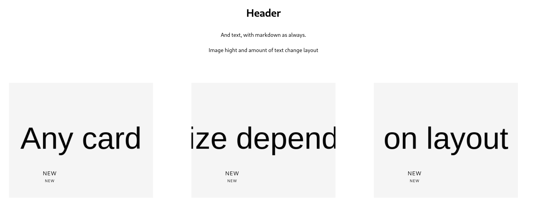
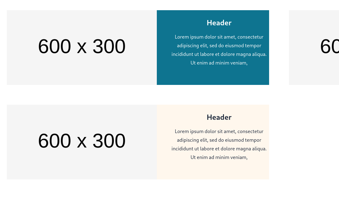
Text may be markdown. The section may have one image than can be embedded into the text by writing IMAGE (in caps) where the image should be inserted. Not more than 200 words or 1000 characters are best. Image size depends on columms, 3 column should be 600 wide and 300 to 600 high.
Shorthand: section_text
Section may not include cards
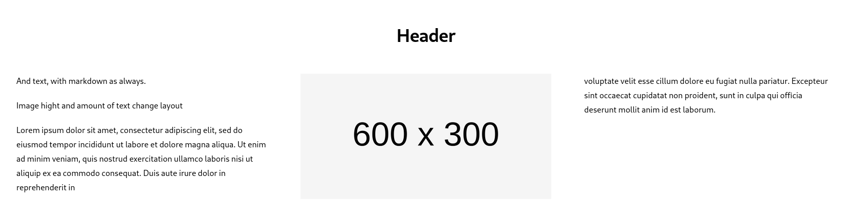
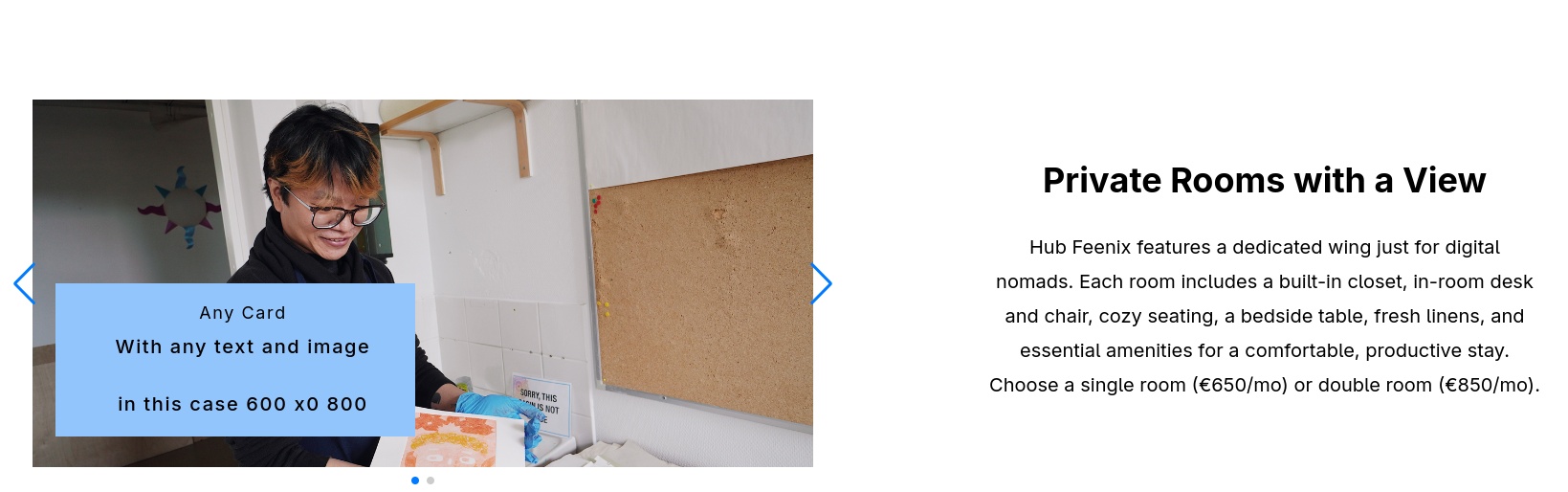
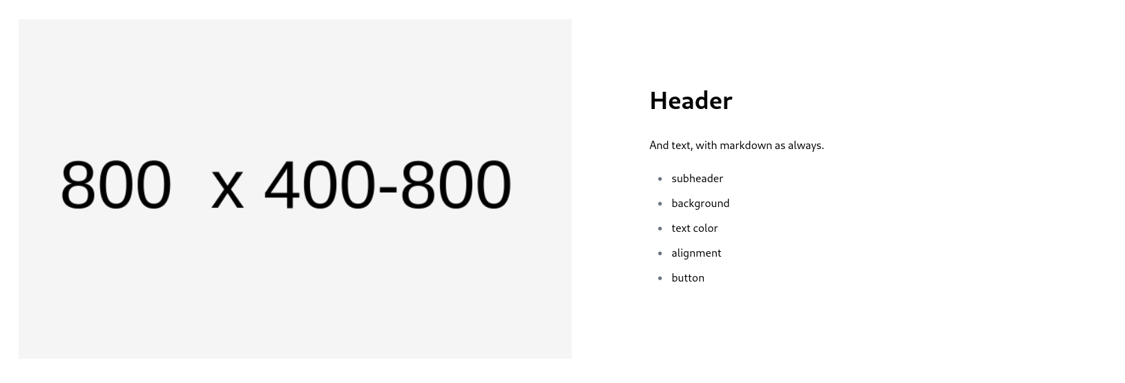
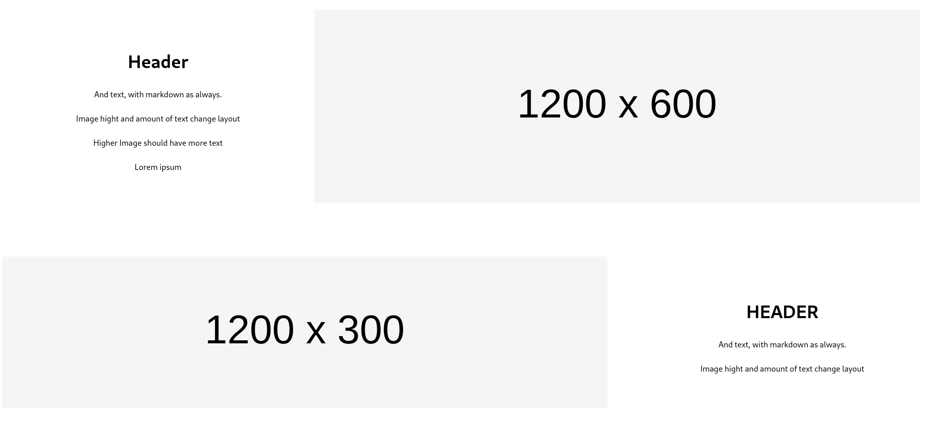
Image on one side, header and text on the other. Order depends on order option. Optional button. Image aspect ratio can be choosen and determines layout. Wide image, narrow look. Square image big look. No portraits.
Shorthand: section_half_image
Section may not include cards
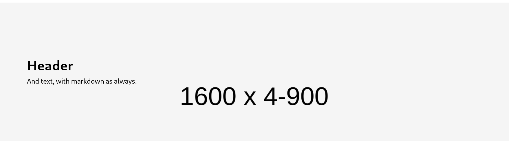
Large picture background with Header and text on top. Adjustable text text alignment (left, center, right). Text may be slightly shaded for readability, text color can be changed too. Image should be 1600 wide and can be between 400 and 900 for different looks
Shorthand: section_full_image
Section may not include cards
Large picture background with Header and text offset. Adjustable text alignment (left, center, right). Image size determines the look or layout. Images should be 1200 wide and 300 - 600 high.
Shorthand: section_large_image
Section may not include cards
Smaller picture with Header and text offset that use more space. Adjustable text alignment (left, center, right). Text section may have background color. Text color can be changed too
Shorthand: section_small_image
Section may not include cards
Just for extra padding
Shorthand: section_spacer
Section may not include cards
Flexible form, with input fields as "cards". Only choose form_field as contained in the form.
Shorthand: form_section
Section may include cards. See card styles below
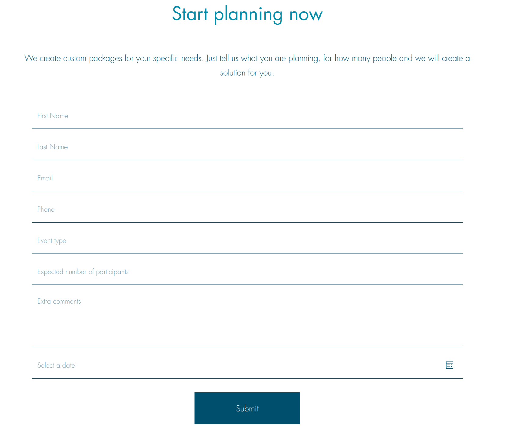
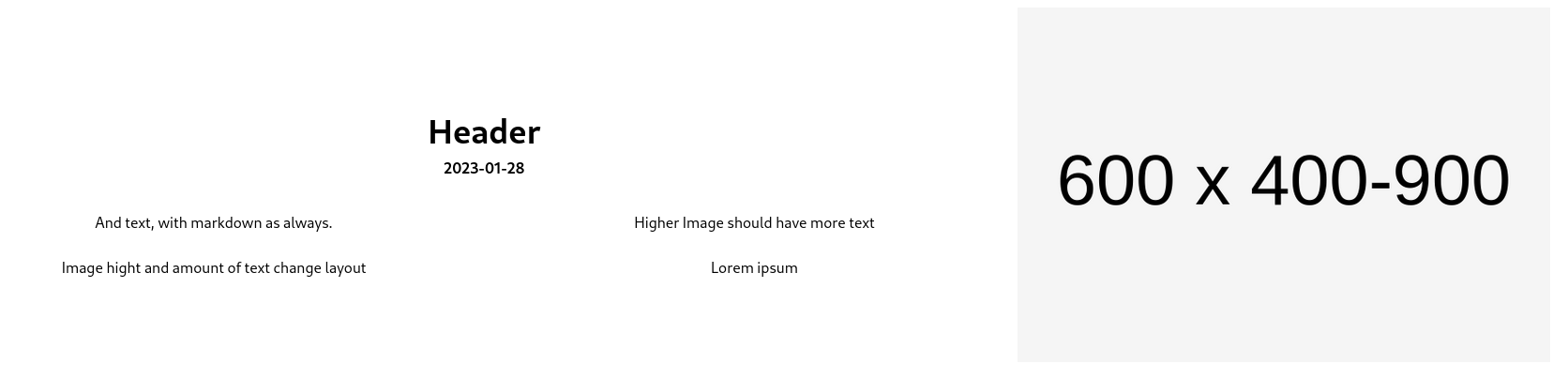
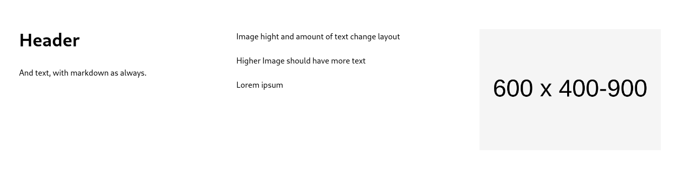
Image on one side, header and text on the other. Order depends on order option. Date is subheader. Extra text possible under both text and picture, as markdown. Image should be 600 wide and 400-900 high, depending on text.
Shorthand: blog_header
Section may not include cards
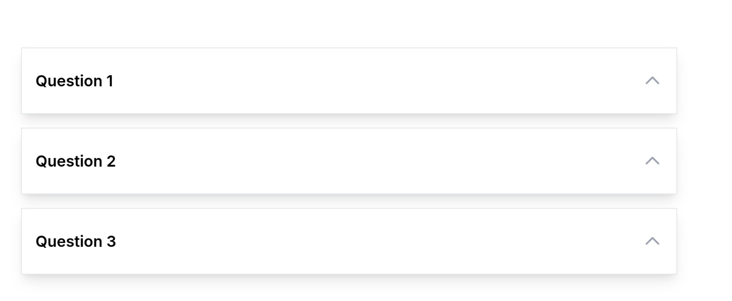
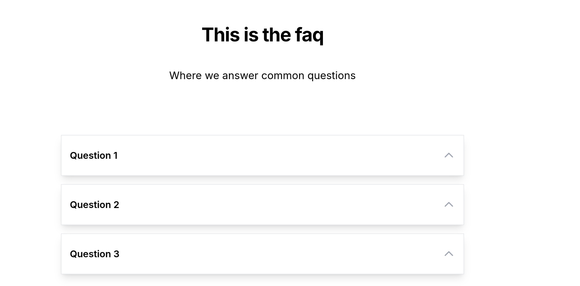
A header with text and collapsable faq layout. Only works proper with faq_item card style
Shorthand: section_faq
Section may include cards. See card styles below
Slider slides any (number) of cards. Columns means how many slides are visible on desktop. Optional header text on top of the slider (like the section with header/text)
Shorthand: section_slider
Section may include cards. See card styles below
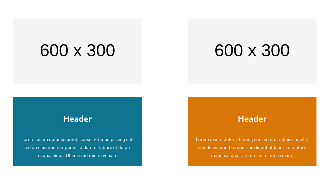
Otherwise quite similar to standard. But there is gap under the image. Images can be wide or square, for 2 column 800 wide, 3 column 600 , 4 column 400
Shorthand: card_normal_round
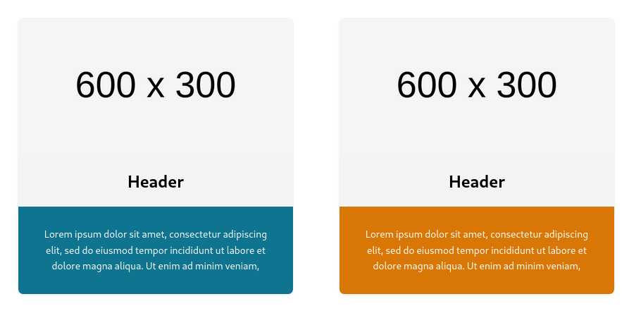
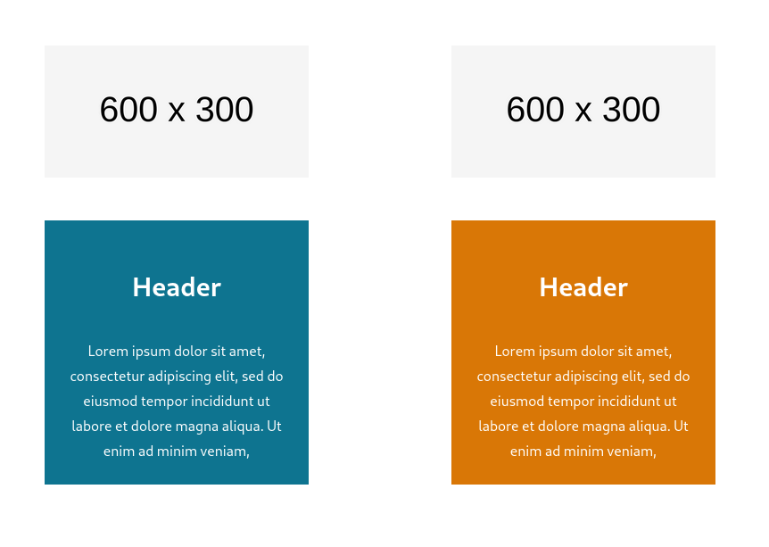
Image, header, text, normal stuff. No margin between image and text. Text alignment option. Also option to turn upside down with order. Images can be wide or square, for 2 column 800 wide, 3 column 600 , 4 column 400
Shorthand: card_normal_square
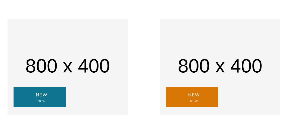
Text in box on top of the imag. Adjustable background and text color to mix/match with images. Box is fixed height. Images can be wide or square, for 2 column 800 wide, 3 column 600 , 4 column 400
Shorthand: card_full_image

Image as is, ie no sizing
Shorthand: card_large_image
Smaller image, large margins Order turns it upside down, image bottom Images can be wide or square, for 2 column 800 wide, 3 column 600 , 4 column 400
Shorthand: card_gap_square
Much like standard square card, just turned sideways. Works best for 2 or three columns. Wide pictures, unless there is a lot of text. Images can be wide or square, for 2 column 600 wide, 3 columns 400
Shorthand: card_wide_square
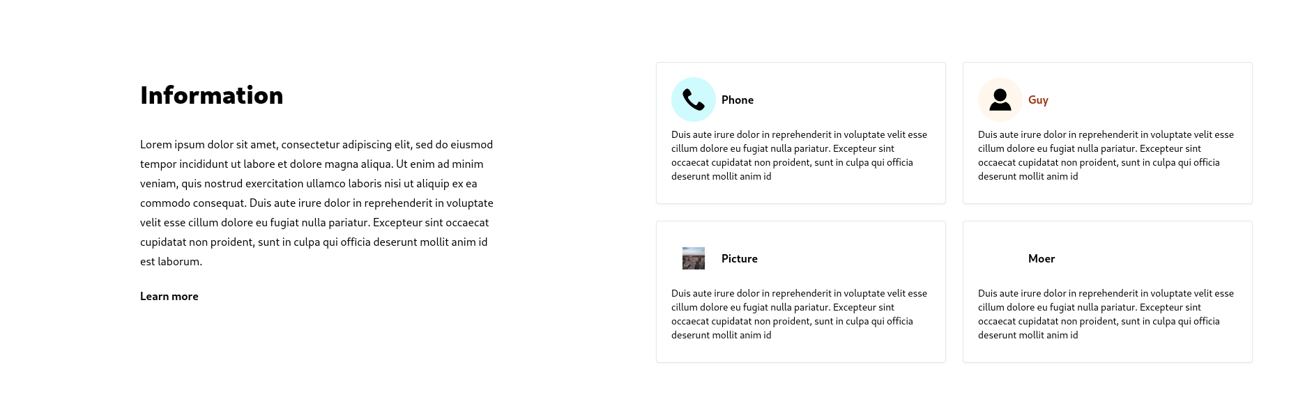
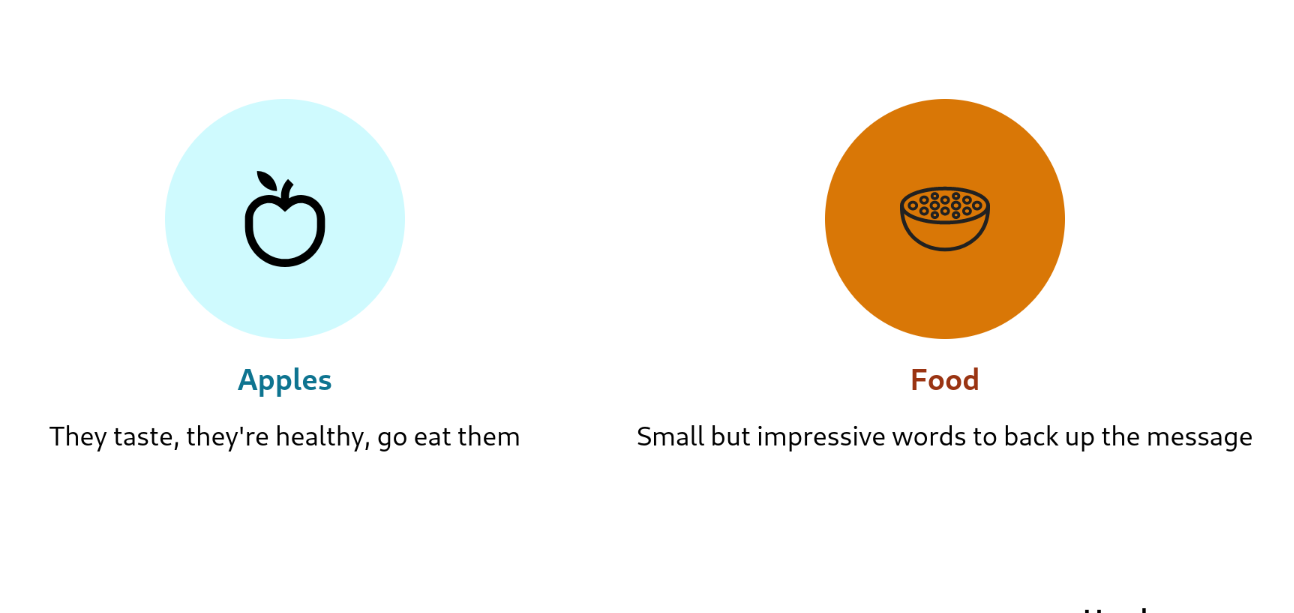
For things where no image is available or apropriate. Making lists a little more interesting to look at. May use svg as image, or normal with transparent bg. Small images or icons.
Shorthand: card_feature_normal
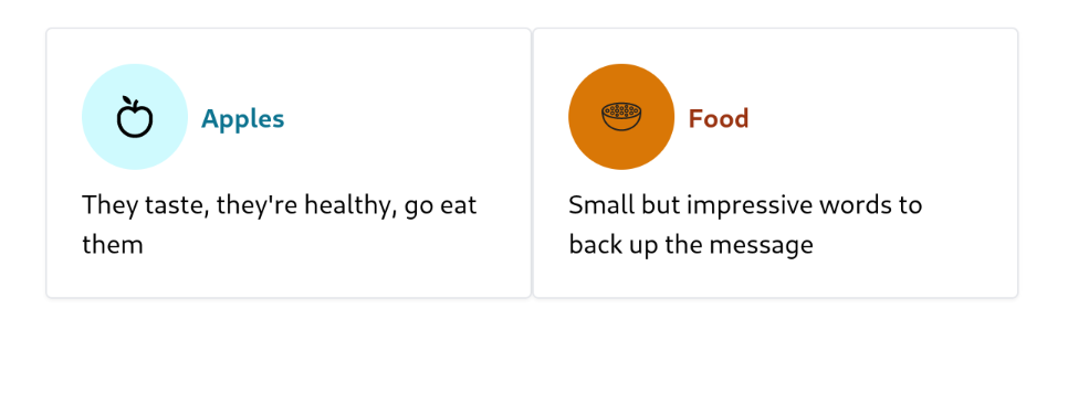
For things where no image is available or apropriate. Making lists a little more interesting to look at. May use svg as image.
Shorthand: card_feature_box
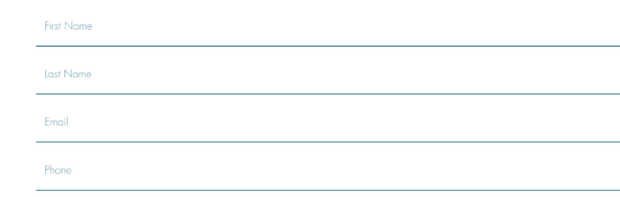
The header is the Name of the field, the description serves as a placeholder. (No image)
Shorthand: form_field
The header is the qustion, the description is the answer. (No image)
Shorthand: faq_item